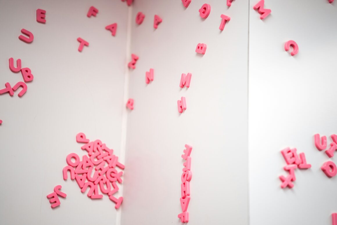
Typography remains at the heart of visual storytelling across branding, graphic design, and digital content creation. As styles evolve, staying current with creative font styles is key to crafting compelling, modern visuals. Designers are pushing the envelope with innovative typefaces that reflect personality and purpose. Thanks to creative platforms, it’s easier than ever to discover fonts that align with today’s aesthetic and functional demands.
Creative Fabrica’s Andrie Letoumeau offers a timely insight:
“What we’re seeing now is a shift toward bold, character-driven fonts. Designers are blending retro nostalgia with clean modernism to produce typography that’s expressive, emotional, and instantly eye-catching.” — Andrie Letoumeau
To keep you on the cutting edge, here’s a breakdown of the top 10 typography trends shaping today’s design landscape.
1. Throwback Typography Makes a Comeback
Retro fonts—channeling everything from groovy 70s to pixel-heavy 90s styles—are dominating current design. These nostalgic typefaces bring character and charm, perfect for branding that needs to stand out with a memorable, vintage-inspired feel.
Best for: Logos, packaging, social content, and nostalgic web design.
2. Sleek and Minimal Sans-Serifs
The minimalist aesthetic continues to thrive, with sans-serif fonts leading the charge. Their clean, straightforward structure ensures excellent legibility and a timeless look that works across media.
Best for: Digital interfaces, editorial layouts, corporate branding, and web content.
3. Organic Handwritten Fonts
Handwritten and script fonts add warmth, intimacy, and a handcrafted touch. From calligraphic to casual, these fonts create a human connection that feels sincere and stylish.
Best for: Invitations, lifestyle branding, packaging, and blog design.
4. Breaking Rules with Experimental Fonts
Typographic experimentation is booming. Designers are creating daring fonts that defy convention—warped shapes, irregular spacing, layered effects—all aimed at making viewers pause and pay attention.
Best for: Album covers, printable posters, art installations, and edgy campaigns.
5. Statement-Making Bold Fonts
Heavy, impactful fonts command attention and communicate strength. They’re not just thick—they’re bold in presence and intent, perfect for grabbing focus in seconds.
Best for: Headlines, promotions, digital ads, and lead visuals.
6. Modern Takes on Classic Serif Fonts
Vintage serif fonts are experiencing a renaissance, often paired with contemporary design elements. Their refined, elegant lines project confidence, heritage, and sophistication.
Best for: Fashion editorials, high-end branding, print magazines, and portfolios.
7. Symmetrical and Geometric Lettering
Geometric typefaces provide structure and modernity with clean lines, precise curves, and symmetry. Their neutral appearance allows them to adapt across many industries.
Best for: Tech branding, startup identity, UI/UX design, and corporate visuals.
8. Dynamic and Adjustable Variable Fonts
Variable fonts offer maximum versatility. Designers can tweak weight, width, and angle in real time, allowing one font to behave like many.
Best for: Responsive design, app UIs, branding systems, and digital platforms.
9. Elegant Outline and Inline Typography
These fonts use outlines or internal line work to emphasize shape over mass. They’re subtle yet distinct, making them great for decorative use without overwhelming the layout.
Best for: Apparel design, event graphics, logos, and stylized social media posts.
10. Layered and Mixed Font Compositions
Using multiple fonts together in one layout is trending—whether by stacking, layering, or blending contrasting styles. It allows for expressive storytelling and strong visual hierarchy.
Best for: Advertising campaigns, posters, book jackets, and creative promos.
Tips for Picking the Right Trend for Your Project
Typography isn’t just about style—it’s about purpose. To select a font that fits your design goals, keep these principles in mind:
- Understand your audience: Fonts evoke emotion; choose one that aligns with your audience’s expectations.
- Prioritize readability: No matter how stylish, your font must communicate clearly—especially on screens.
- Match the medium: Context matters. A font that works for print might not suit web or mobile.
- Blend style with longevity: Choose trends that feel fresh but won’t go out of date next month.
Final Takeaway: Let Typography Lead the Way
Staying informed about typography trends empowers designers to craft visuals that feel timely, relevant, and emotionally impactful. With an abundance of expressive fonts available, creatives have endless tools for enhancing their designs.
Adopt these top 10 font trends to elevate your work—captivate your audience, strengthen brand presence, and create lasting impressions through the power of typography.


